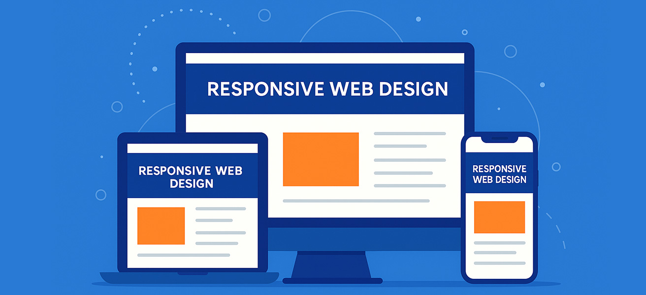
In today’s mobile-first world, having a website that looks great on every screen isn’t a luxury—it’s a necessity. Whether your audience visits from a laptop, smartphone, or tablet, your website needs to adapt seamlessly. That’s where responsive web design comes in.
What is Responsive Web Design?
Responsive web design is an approach to designing websites so that they automatically adjust and look good on all screen sizes—from desktops to smartphones. It ensures your content remains easy to read, navigate, and interact with, no matter what device your visitors are using.
Instead of creating separate versions for mobile and desktop, a responsive website uses flexible layouts, images, and media queries (known as breakpoints) to adapt to different devices.
Why Responsive Design Matters
1. Better User Experience
If a visitor has to pinch, zoom, or scroll sideways just to read your content—they’ll likely leave. A mobile-friendly website ensures users stay longer, engage more, and trust your brand.
2. Improved SEO
Google prioritises mobile-friendly websites in its search results. A responsive site not only improves usability but can also enhance your visibility on search engines. It’s a critical part of modern website development.
3. Cost-Effective Maintenance
Managing one website that works on all devices is far more efficient than maintaining separate mobile and desktop versions.
Common Issues with Non-Responsive Websites
- Text that’s too small to read
- Images that don’t scale properly
- Buttons that are hard to tap on mobile
- Slow mobile loading speeds
- Poor rankings in mobile search results
How Responsive Design Works (Brief Overview)
Responsive design uses a combination of flexible grids, flexible images, and CSS media queries to adapt your layout. For example:
- Breakpoints: Defined screen widths where layout adjustments kick in (e.g. 768px for tablets, 1024px for desktops)
- Fluid Grids: Layouts that use relative units like percentages instead of fixed pixels
- Media Queries: CSS rules that apply styles depending on the screen size or device type
How CoopCode Builds Responsive Websites
At CoopCode, we design every website with responsiveness in mind from day one. Whether you need a brochure site or a fully bespoke platform, we ensure your content looks pixel-perfect on any screen.
We combine modern frameworks, lightweight code, and best practices to deliver responsive websites that not only look amazing—but load fast and perform beautifully.
Make Your Website Work on Every Device
With more than 60% of web traffic now coming from mobile devices, your website simply can’t afford to be desktop-only. A responsive design improves user experience, SEO, and overall brand perception.
Ready to upgrade your website? Let CoopCode create a responsive design that works for your business—on every device.